| |
|
| |
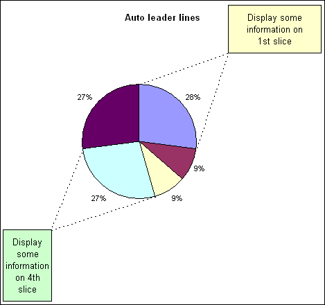
This chart has 2
textboxes for displaying information regarding the 1st and 4th
slice. The custom leader lines will adjust along with the pie
chart data to always connect the textbox corner with the two end
points of the pie slice.
This effect is
created by using a combination chart, pie and xy-scatter, and
some math formula.
|
Below is all the data and
formula required to create the chart. The highlighted cells
contain the actual charted data.
|
|
|
A |
B |
C |
D |
E |
F |
| 1 |
|
Auto leader
lines |
|
% |
Angle |
Radius |
| 2 |
a |
3 |
|
0.272727273 |
98.18182 |
0.61 |
| 3 |
b |
1 |
|
0.090909091 |
32.72727 |
|
| 4 |
c |
1 |
|
0.090909091 |
32.72727 |
|
| 5 |
d |
3 |
|
0.272727273 |
98.18182 |
|
| 6 |
e |
3 |
|
0.272727273 |
98.18182 |
|
| 7 |
|
|
|
|
|
|
| 8 |
|
|
|
|
|
|
| 9 |
Slice |
|
X |
Y |
|
|
| 10 |
1 |
90.00 |
3.74E-17 |
0.61 |
|
|
| 11 |
|
|
0.95 |
0.95 |
|
|
| 12 |
|
-8.18 |
0.603791 |
-0.086812051 |
|
|
| 13 |
|
|
|
|
|
|
| 14 |
4 |
-73.64 |
0.171857 |
-0.585290714 |
|
|
| 15 |
|
|
-0.95 |
-0.95 |
|
|
| 16 |
|
-171.82 |
-0.60379 |
-0.086812051 |
|
|
Formulas
| |
A |
B |
C |
D |
E |
F |
| 1 |
|
Auto leader
lines |
|
% |
Angle |
Radius |
| 2 |
a |
3 |
|
=B2/SUM($B$2:$B$6) |
=360*D2 |
0.61 |
| 3 |
b |
1 |
|
=B3/SUM($B$2:$B$6) |
=360*D3 |
|
| 4 |
c |
1 |
|
=B4/SUM($B$2:$B$6) |
=360*D4 |
|
| 5 |
d |
3 |
|
=B5/SUM($B$2:$B$6) |
=360*D5 |
|
| 6 |
e |
3 |
|
=B6/SUM($B$2:$B$6) |
=360*D6 |
|
| 7 |
|
|
|
|
|
|
| 8 |
|
|
|
|
|
|
| 9 |
Slice |
|
X |
Y |
|
|
| 10 |
1 |
90 |
=COS(RADIANS(B10))*$F$2 |
=SIN(RADIANS(B10))*$F$2 |
|
|
| 11 |
|
|
0.95 |
0.95 |
|
|
| 12 |
|
=B10-E2 |
=COS(RADIANS(B12))*$F$2 |
=SIN(RADIANS(B12))*$F$2 |
|
|
| 13 |
|
|
|
|
|
|
| 14 |
4 |
=90-SUM(E2:E4) |
=COS(RADIANS(B14))*$F$2 |
=SIN(RADIANS(B14))*$F$2 |
|
|
| 15 |
|
|
-0.95 |
-0.95 |
|
|
| 16 |
|
=B14-E5 |
=COS(RADIANS(B16))*$F$2 |
=SIN(RADIANS(B16))*$F$2 |
|
|
|
|
|
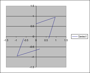
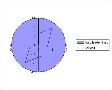
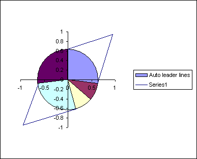
Although the finished chart
is a pie chart it is easier to construct if we begin with the xy-scatter
chart.
Select the range C10:D16 and
use the chart wizard to create a standard xy-scatter chart.
|
|
|
 |
|
|
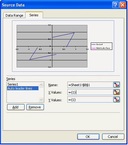
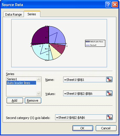
Use the source data dialog to
add another series to the chart.
|
|
|
 |
|
|
Select the 2nd data series
and change the chart type to pie.
|
|
|
|
|
|
Use the source data to
specify the location of data, B2:B6, and labels, A2:A6, for the
pie chart.
|
|
|
 |
|
|
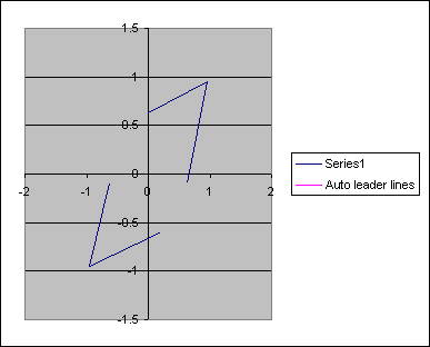
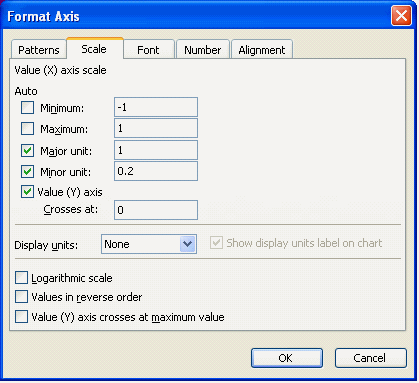
Change the axis properties
for both x and y axis. Set the minimum and maximum value to -1
and 1 respectively.
|
|
|
 |
|
|
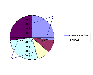
The only problem with the
chart in its current configuration is that the area available
for the leader lines is restricted to the plot area, which is
too close to the edge of the pie chart.
|
|
|
 |
|
|
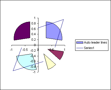
To increase this area we need
to explode and re assemble the pie chart.
Select the pie and drag the slices away from the center. The
further away you drag the slices the smaller the pie chart will
end up.
|
|
|
 |
|
|
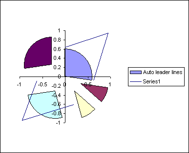
After exploding and thereby
reducing the size of the pie we need to drag the slice back
together. If you do this whilst all the slices are selected then
the pie will return to its original size. You have to do each
piece individually. So select the pie and then select an
individual slice. Drag this back to the center and then repeat
for all the other pieces.
|
|
|
 |
|
|
You now have a smaller pie
chart which will allow more space for the leader lines.
The actual radius of the
chart can be entered in to the cell F2
The end point of the leader lines, where the 2 lines meet, is
controlled by the values used in cells C11:D11 and C15:D15. The
position of contact of the leader lines with the pies
circumference is calculated via the formulas.
|
|
|
 |
|
|
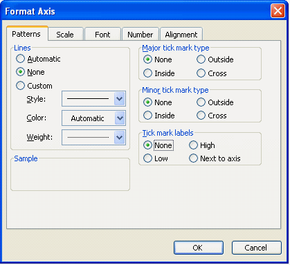
Format both axis to remove
lines, labels and tickmarks.
|
|
|
 |
|
|
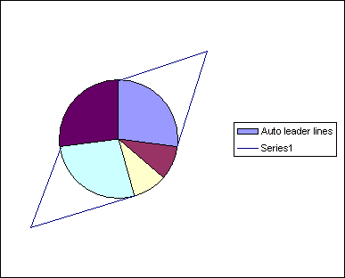
You should now have a pie
chart with leader lines for slices 1 and 4. This will
automatically adjust for any changes in the pie charts data.
|
|
|
 |
|
|
Further formatting of the
pie, leader lines, legend and chart can be applied.
As can the textboxes used to hold any information needed.
|
|
|
| |
|
|
|
 AJP Excel Information