

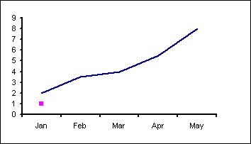
Axis pointer
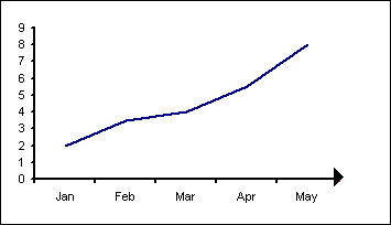
Using a data label on a dummy data series.
Here is our data set. The actual chart data is in the range A1:B6
The values in A10:B10 are for positioning the dummy data point
| A | B | |
| 1 | My Data | |
| 2 | Jan | 2 |
| 3 | Feb | 3.5 |
| 4 | Mar | 4 |
| 5 | Apr | 5.5 |
| 6 | May | 8 |
| 7 | ||
| 8 | ||
| 9 | X | Y |
| 10 | 5.5 | 0 |
Select the range A1:B6 and use the chart wizard to create a standard Line chart.
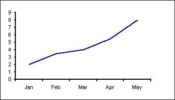
Right click the chart, which will display a popup menu, select the Source Data... item. Add a new data series, which I have called 'Axis Arrow'
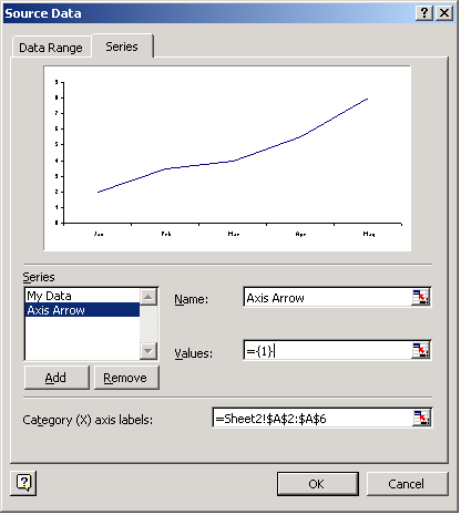
Change the Chart Type of the 'Axis Arrow' data series to XY Scatter, markers only. Format the 'Axis Arrow' data series so Value data labels are displayed.
Then use the Source Data dialog again to set the X and Y ranges.
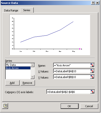
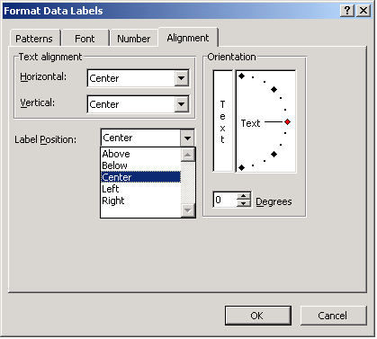
Edit the data label and replace the text with 4. If we then format the data label to use the Marlett font we will get a right hand arrow head. Increase the font size to suit your chart. Also adjust the label position so that it is centered over the data point.
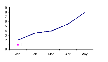
This will then give use the axis pointer.
The same technique can be adapted for the Y axis.
3 |
3 |
Left |
4 |
4 |
Right |
5 |
5 |
Up |
6 |
6 |
Down |
Create the chart and add a new data series as described above. No need for data labels this time.
 Create a pointer using the Auto shapes.
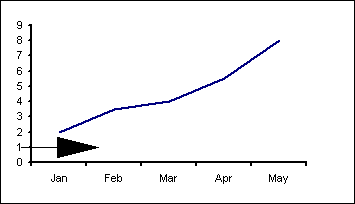 Then use the Source Data dialog to set the X and Y ranges.
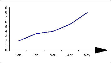 Once again the technique can be adapted for the Y axis.
Created August 2004
Last updated 5th August 2014